
Behind the Brand: Redesigning the ODU Graphic Design Club’s Identity
Overview
The objective of this project was to develop a cohesive and engaging brand identity for the Graphic Design Club at Old Dominion University. The club sought a refreshed visual identity that would not only attract new members but also reflect its mission of fostering a collaborative environment for aspiring designers.
Goal
Create a visually compelling and cohesive brand identity for the Graphic Design Club at Old Dominion University that enhances its visibility, fosters a sense of community, and attracts new members by showcasing the club as a hub of creativity, collaboration, and professional development for student designers.
Skills
Branding & Visual Identity
Adobe Illustrator

Challenges
ODU’s Graphic Design Club needed a brand that would stand out within the university's diverse campus. The design had to be versatile enough for various platforms, including social media, print materials, and event signage. The brand needed to appeal to a range of students, from freshmen exploring design to experienced seniors building their portfolios.
Research
The branding process began with inspiration from an older ODU logo and the university’s official color palette, grounding the new design in ODU’s visual legacy. This approach allowed us to create a cohesive identity that felt connected to the university while showcasing the Graphic Design Club’s innovative spirit. I experimented with shapes and colors that balanced tradition with creativity, resulting in a logo and palette that appealed to both new and returning students.
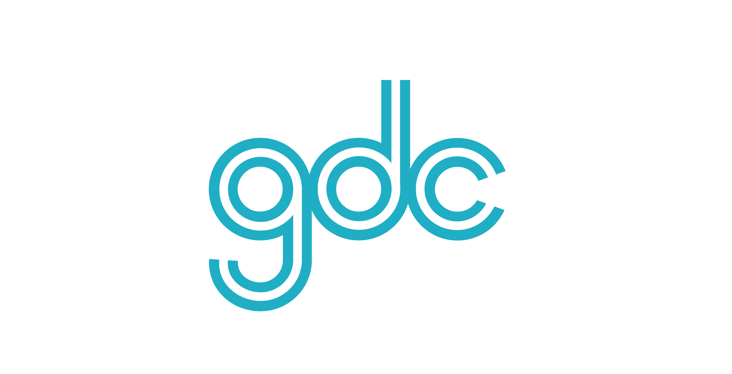
Primary Logo


Secondary Logo


Wordmark


Tone for the Club
The Graphic Design Club provides a collaborative environment where members can create and refine their designs through hands-on projects. It encourages experimentation and creative risk-taking, allowing students to push boundaries while receiving valuable peer feedback. Working with others fosters teamwork and idea development, helping improve both technical and conceptual skills. Access to resources and tools enhances the design process, giving members the opportunity to grow their portfolios. Overall, the club offers a supportive space for honing design skills and building professional connections.

Colors
The colors used in the Graphic Design Club's branding are drawn from the official Old Dominion University color palette, ensuring a strong connection to the university's identity.


Logo Isolation
The primary logo has an isolation zone which is a third of the height of the circles. use the isolation zone when making posters.

Brand Assets
The stripe is from the primary logo and has a ratio of white to sea foam of 1:3. the stripe can be modified to create assets for social media and posters.

Grid System
Instagram Grid
For Instagram, it follows the rule of thirds. The club’s stripe asset will go within the grid to keep the Instagram feed consistent. The stripe must be fully opaque.

Poster Grid
For posters, it is set up for the primary logo; each rectangle is the size of the primary logo. The primary logo can be placed anywhere in the grid. The text on the poster should fit properly within the grid, as well as the stripe asset


Conclusion
The rebranding of the Graphic Design Club at ODU has successfully aligned the organization’s visual identity with its mission, attracting a more diverse group of members and creating a sense of pride among current members. This project demonstrates the impact of thoughtful design in building a community and engaging audiences.